


1
2
3
4
5
6
7
8
9
Wireframes and prototype for UX developmental work.
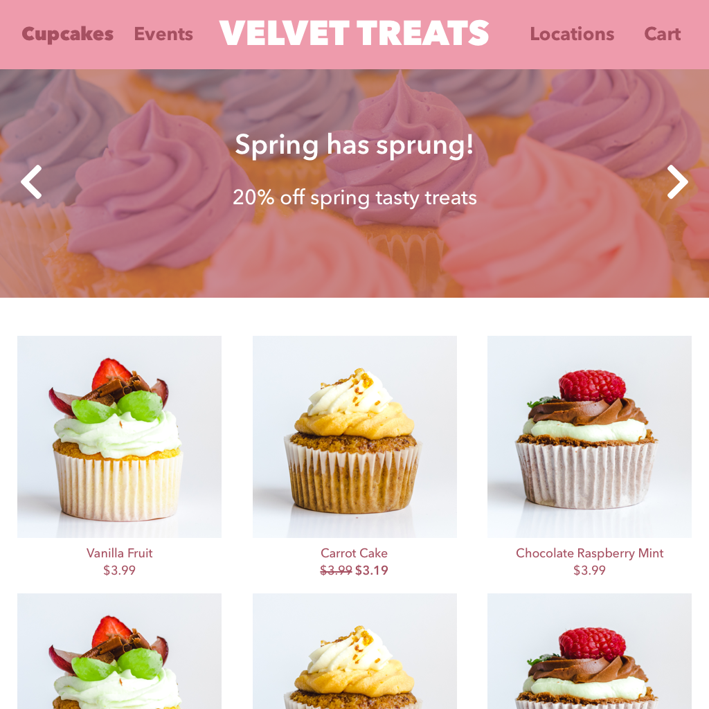
A simple e-commerce website for a cupcake business in order to sell their products online. Gives an example of how the landing page could be laid out to instantly drive users into looking at the cupcakes and enticing them to purchase.
Wireframe for the landing page of the website on desktop. The images will stack down to one or two columns for mobile and tablet layout. The header navigation links will switch to a hamburger menu on mobile to save space.
Wireframe for the desktop cart page. It gives the user a clear understanding of what products they’re choosing, quantity of each, price, etc. Separating the products and total order details into two columns allows the user to see both at the same time on desktop without scrolling.